
UI 구성 실습 - textAlign, Arrangement/Alignment, weight
연습: Compose 기본사항 | Android Developers
기본 UI 컴포저블 개념을 적용하여 특정 문제에 관한 화면을 구현합니다.
developer.android.com
위의 페이지를 참고해서 지금까지 배운 내용들을 바탕으로 같이 실습을 해보자
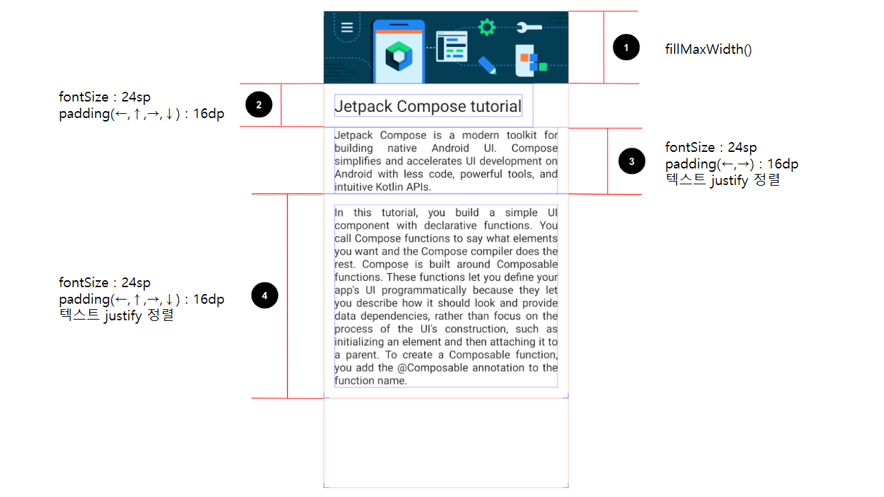
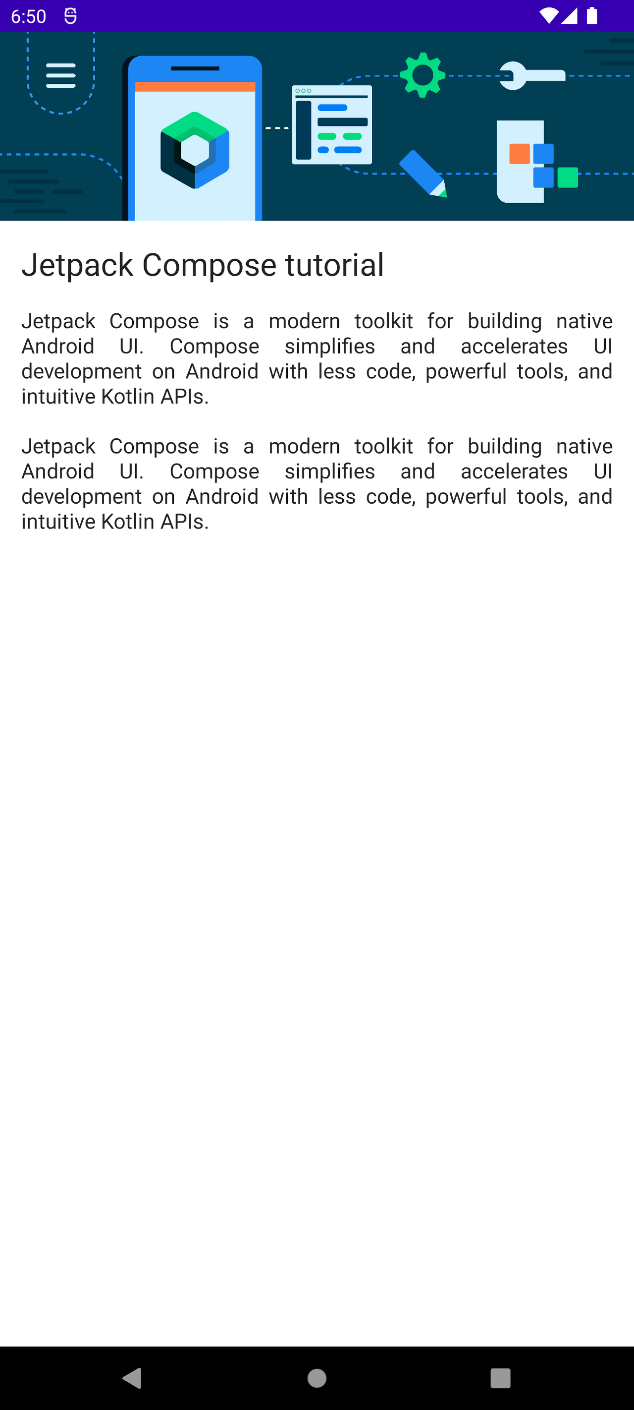
1. Compose에 대한 도움말을 제공하는 UI
상세사항은 다음과 같다
크게 어려운 점은 없어보인다
이미지를 넣고 fillMaxWidth 해준다음
Column 컨테이너 안에 Image와 Text Composable을 3개를 넣고 각각에 맞는 인자를 넘겨주면 된다
그리고 문자열을 외부에서 불러오면 끝
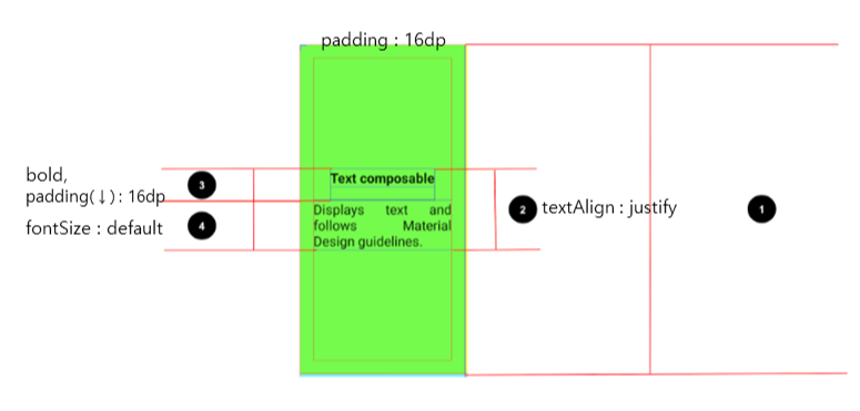
추가적인 내용으로 textAlign인자가 있는데
개발공부 하다가 어디서 한 번쯤 봤을 친구들이다
justify, start, end, left, right, center로 글자를 정렬하는 것이다
justify는 양쪽 정렬이라고 하는데 보통 한글로 문서작업하다 보면
자간 엄청 넓게 한 줄 표시하는 정렬이 있는데 그걸 생각하면 된다
완성 코드는 다음과 같다
package com.example.composedescription

import android.os.Bundle
import androidx.activity.ComponentActivity
import androidx.activity.compose.setContent
import androidx.compose.foundation.Image
import androidx.compose.foundation.layout.*
import androidx.compose.material.MaterialTheme
import androidx.compose.material.Surface
import androidx.compose.material.Text
import androidx.compose.runtime.Composable
import androidx.compose.ui.Modifier
import androidx.compose.ui.res.painterResource
import androidx.compose.ui.text.style.TextAlign
import androidx.compose.ui.tooling.preview.Preview
import androidx.compose.ui.unit.dp
import androidx.compose.ui.unit.sp
import com.example.composedescription.ui.theme.ComposeDescriptionTheme

class MainActivity : ComponentActivity() {
    override fun onCreate(savedInstanceState: Bundle?) {
        super.onCreate(savedInstanceState)
        setContent {
            ComposeDescriptionTheme {
                // A surface container using the 'background' color from the theme
                Surface(
                    modifier = Modifier.fillMaxSize(),
                    color = MaterialTheme.colors.background
                ) {
                    MainUI(getString(R.string.text1), getString(R.string.text2), getString(R.string.text3))
                }
            }
        }
    }
}

@Composable
fun MainUI(text1: String, text2: String, text3: String) {
    val image = painterResource(R.drawable.bg_compose_background)
    Column {
        Image(
            painter = image,
            contentDescription = null,
            modifier = Modifier.fillMaxWidth()
        )
        Text(
            text = text1,
            fontSize = 24.sp,
            modifier = Modifier
                .padding(16.dp)
        )
        Text(
            text = text2,
            modifier = Modifier.padding(start = 16.dp, end = 16.dp),
            textAlign = TextAlign.Justify
        )
        Text(
            text = text2,
            modifier = Modifier.padding(16.dp),
            textAlign = TextAlign.Justify
        )
    }
}

@Preview(showBackground = true)
@Composable
fun DefaultPreview() {
    ComposeDescriptionTheme {
        MainUI("1", "2", "3")
    }
}
결과 화면
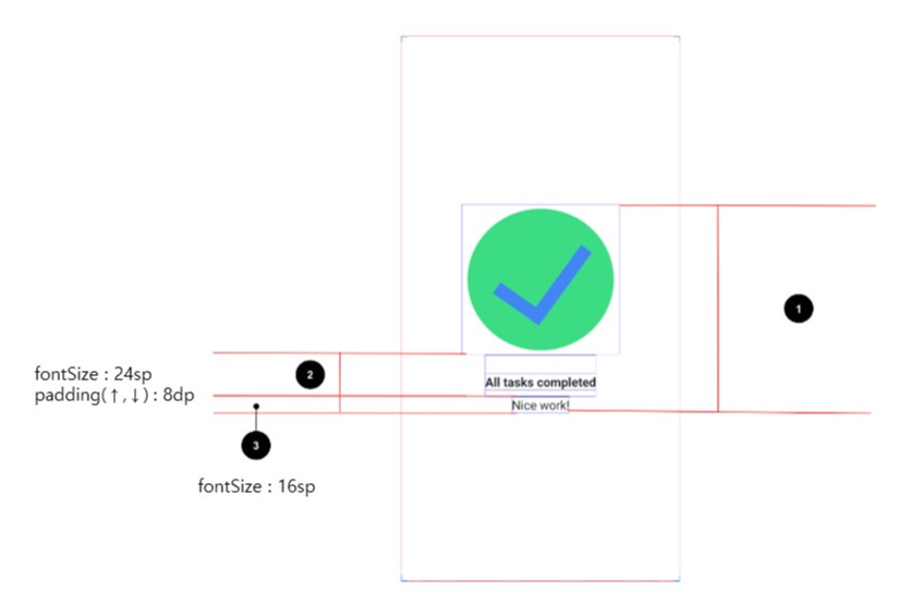
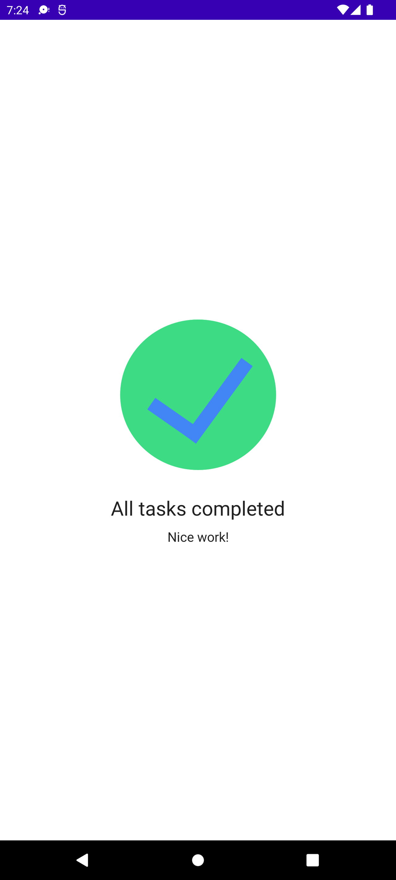
2. 모든 할 일이 완료됐음을 알리는 UI
상세사항은 다음과 같다
중요한 건 Box나 Column 같은 컨테이너도 Text 같은 Composable처럼 인자를 넘겨줄 수 있다는 점이다
왜냐하면 Container도 Composable이기 때문이다
Column처럼 Container의 자식 Composable을 정렬시켜줄 수 있는데
여기서 Arrangement와 Alignment의 개념을 이해하고 가자
Arrangement는 composable들을 얼마나 띄어서 나열할 것인지를 의미한다
Column에서는 수직방향으로, Row에서는 수평방향으로 composable들을 나열하게 된다
Alignment는 Composable들을 Arrangement와 수직인 방향의 어느쪽으로 정렬할지를 결정한다
이게 말이 어려운데 조잡한 그림하나만 참고해보자
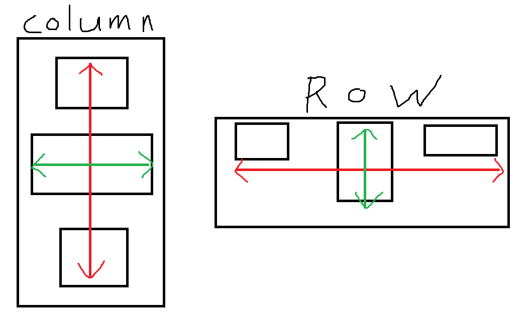
이 그림처럼 Container의 방향대로 얼마나 떨어져서 배치할 것인가(빨간색)이 Arrangement
Container의 수직인 방향에서 어디쪽에 붙일 것인가(초록색)가 Alignment이다
결과 코드는 다음과 같다
package com.example.taskmanager

import android.graphics.Paint
import android.os.Bundle
import androidx.activity.ComponentActivity
import androidx.activity.compose.setContent
import androidx.compose.foundation.Image
import androidx.compose.foundation.layout.*
import androidx.compose.material.MaterialTheme
import androidx.compose.material.Surface
import androidx.compose.material.Text
import androidx.compose.runtime.Composable
import androidx.compose.ui.Alignment
import androidx.compose.ui.Modifier
import androidx.compose.ui.res.painterResource
import androidx.compose.ui.tooling.preview.Preview
import androidx.compose.ui.unit.dp
import androidx.compose.ui.unit.sp
import com.example.taskmanager.ui.theme.TaskManagerTheme

class MainActivity : ComponentActivity() {
    override fun onCreate(savedInstanceState: Bundle?) {
        super.onCreate(savedInstanceState)
        setContent {
            TaskManagerTheme {
                // A surface container using the 'background' color from the theme
                Surface(
                    modifier = Modifier.fillMaxSize(),
                    color = MaterialTheme.colors.background
                ) {
                    MainUI(getString(R.string.text1), getString(R.string.text2))
                }
            }
        }
    }
}

@Composable
fun MainUI(text1: String, text2: String) {

    val image = painterResource(R.drawable.ic_task_completed)

    Box {
        Column(
            modifier = Modifier
                .fillMaxWidth()
                .fillMaxHeight(),
            horizontalAlignment = Alignment.CenterHorizontally,
            verticalArrangement = Arrangement.Center
        ) {
            Image(
                painter = image,
                contentDescription = null
            )
            Text(
                text = text1,
                fontSize = 24.sp,
                modifier = Modifier
                    .padding(top = 24.dp, bottom = 8.dp)
            )
            Text(
                text = text2,
                fontSize = 16.sp
            )
        }
    }

}

@Preview(showBackground = true)
@Composable
fun DefaultPreview() {
    TaskManagerTheme {
        MainUI("text1", "text2")
    }
}
결과화면
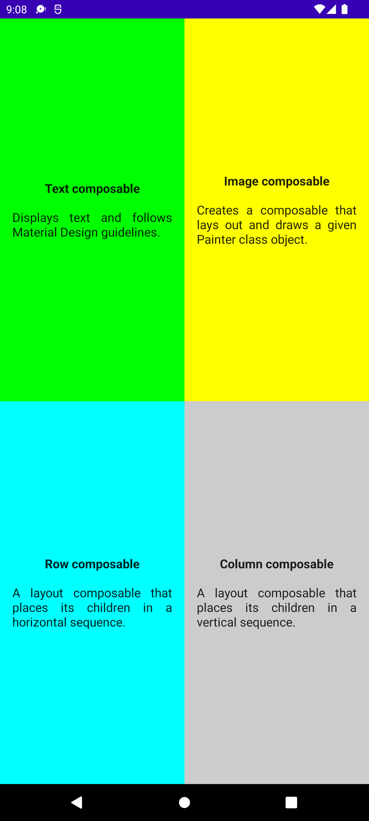
3. 4분할 된 UI
상세사항은 다음과 같다
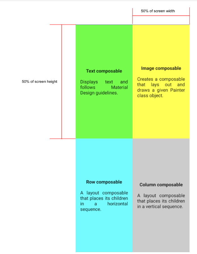
일단 화면을 분할하려면 weight라는 함수에 대해서 알아야 한다
Row와 Column에서 몇대몇 비율로 분할해줄지를 결정할 수 있는 함수이다
비율을 뜻하는 인자는 float형 숫자를 넘겨준다(그래서 숫자 뒤에 f가 붙는다)
예를 들어 같은 Column 안에 있는 두 개의 Row가 있을 때 각각의 Row의 weight에
1f, 1f 이렇게 넘겨주면 값이 같으니까 같은 비율 즉 5:5로 나눠준다
그리고 저 하나의 사분면이 계속 반복되니까 따로 하나의 함수를 만들어서 빼준다
fontWeight는 새로 나왔지만 어디서 본 것 같으니까 자세한 설명은 생략한다
결과 코드는 다음과 같다
package com.example.composequadrant

import android.graphics.Paint
import android.os.Bundle
import androidx.activity.ComponentActivity
import androidx.activity.compose.setContent
import androidx.compose.foundation.background
import androidx.compose.foundation.horizontalScroll
import androidx.compose.foundation.layout.*
import androidx.compose.material.MaterialTheme
import androidx.compose.material.Surface
import androidx.compose.material.Text
import androidx.compose.runtime.Composable
import androidx.compose.ui.Alignment
import androidx.compose.ui.Modifier
import androidx.compose.ui.graphics.Color
import androidx.compose.ui.modifier.modifierLocalConsumer
import androidx.compose.ui.res.stringResource
import androidx.compose.ui.text.font.FontWeight
import androidx.compose.ui.text.style.TextAlign
import androidx.compose.ui.tooling.preview.Preview
import androidx.compose.ui.unit.dp
import com.example.composequadrant.ui.theme.ComposeQuadrantTheme

class MainActivity : ComponentActivity() {
    override fun onCreate(savedInstanceState: Bundle?) {
        super.onCreate(savedInstanceState)
        setContent {
            ComposeQuadrantTheme {
                // A surface container using the 'background' color from the theme
                Surface(
                    modifier = Modifier.fillMaxSize(),
                    color = MaterialTheme.colors.background
                ) {
                    MainUI()
                }
            }
        }
    }
}

@Composable
fun MainUI() {
    Column(
    ) {
        Row(
            modifier = Modifier.fillMaxWidth()
                .weight(1f)
        ){
            QuadrantCard(
                stringResource(R.string.title1),
                stringResource(R.string.text1),
                androidx.compose.ui.graphics.Color.Green,
                Modifier.weight(1f)
            )
            QuadrantCard(
                stringResource(R.string.title2),
                stringResource(R.string.text2),
                androidx.compose.ui.graphics.Color.Yellow,
                Modifier.weight(1f)
            )
        }
        Row(
            modifier = Modifier.fillMaxWidth()
                .weight(1f)
        ){
            QuadrantCard(
                stringResource(R.string.title3),
                stringResource(R.string.text3),
                androidx.compose.ui.graphics.Color.Cyan,
                Modifier.weight(1f)
            )
            QuadrantCard(
            stringResource(R.string.title4),
            stringResource(R.string.text4),
                androidx.compose.ui.graphics.Color.LightGray,
                Modifier.weight(1f)
            )
        }
    }
}

@Composable
fun QuadrantCard(title: String, text: String, color: Color, modifier: Modifier = Modifier) {
    Column(
        modifier = modifier
            .fillMaxSize()
            .background(color)
            .padding(16.dp),
        horizontalAlignment = Alignment.CenterHorizontally,
        verticalArrangement = Arrangement.Center
    ) {
        Text(
            text = title,
            fontWeight = FontWeight.Bold,
            modifier = Modifier.padding(bottom = 16.dp)
        )
        Text(
            text = text,
            textAlign = TextAlign.Justify
        )
    }
}

@Preview(showBackground = true)
@Composable
fun DefaultPreview() {
    ComposeQuadrantTheme {
        MainUI()
    }
}
결과화면
'기타 > 안드로이드' 카테고리의 다른 글
| Kotlin의 조건문 (0) | 2022.10.14 |
|---|---|
| UI 구성 실습 - 블로그 명함 UI 작성 (0) | 2022.10.14 |
| BirthDayCard App - Image Composable, wrapContentWidth, stringResource (0) | 2022.10.13 |
| BirthDayCard App - Column Container, 람다후행문법 (0) | 2022.10.13 |
| Empty Compose Activity - Activity, Composable 함수, Preview 함수 (0) | 2022.10.13 |


