Woof App : Material Design으로 꾸미기
Jetpack Compose를 사용한 Material Theming
Jetpack Compose를 사용한 Material Theming | Android Developers
색상, 도형, 서체에 Material 테마 설정을 추가하는 방법을 알아봅니다.
developer.android.com
위 페이지를 참고하여 Woof라는 이름의 어플을 이쁘게 꾸며보자
개요
Material Design은 google에서 만든 디자인 시스템이다
이를 이용해서
이미 기능적으로 완성된 Woof라는 어플을 꾸며보자
우선 다음과 같은 url을 이용해서 시작코드를 가져와보자
https://github.com/google-developer-training/basic-android-kotlin-compose-training-woof
git이 뭔지는 아는데 Android Studio에서 어떻게 가져오는 지 모르는 사람들을 위한 설명이다
위의 메뉴바에서 File->New->Project from Version Control을 선택해준다
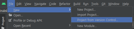
그리고 위의 url을 복사해서 입력해주면 git repository에서 시작 코드를 가져올 수 있다
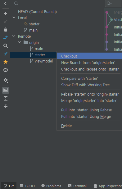
이제 왼쪽 하단에서 Git을 선택해주고 starter branch를 우클릭한 뒤 checkout을 선택해주자
둘러보기
우선 시작코드와 우리가 적용할 color, shape, font를 확인해보자
Dog.kt
MainActivity.kt
위의 두 파일의 코드를 살펴보면 설명할 것이 없다...
왜냐하면 이전에 만들어봤던 동기부여앱, Course앱과 동일한 구성이기 때문이다
Theme.kt
private val DarkColorPalette = darkColors(
    primary = Purple200,
    primaryVariant = Purple700,
    secondary = Teal200
)

private val LightColorPalette = lightColors(
    primary = Purple500,
    primaryVariant = Purple700,
    secondary = Teal200

    /* Other default colors to override
    background = Color.White,
    surface = Color.White,
    onPrimary = Color.White,
    onSecondary = Color.Black,
    onBackground = Color.Black,
    onSurface = Color.Black,
    */
)

@Composable
fun WoofTheme(darkTheme: Boolean = isSystemInDarkTheme(), content: @Composable () -> Unit) {
    val colors = if (darkTheme) {
        DarkColorPalette
    } else {
        LightColorPalette
    }

    MaterialTheme(
        colors = colors,
        typography = Typography,
        shapes = Shapes,
        content = content
    )
}lightColors와 darkColors는 Colors를 상속하면서 기본값을 가지는 친구들이다
이 친구는 보자마자 무릎을 탁 치게 된다
왜냐하면 WoofTheme이란 친구를 보면 그동안 MainActivity.kt에서 숱하게 봐왔던
무슨무슨Theme의 정체를 알 수 있기 때문이다
대충 유추했겠지만 무슨무슨Theme은
스타일 정보를 담고 있는 객체 정도로 생각할 수 있다
우리가 색을 입력할 때 MaterialTheme.colors.red등의 코드로
자주 쓰곤 했던 MaterialTheme은 Object이고
저기 코드에 보이는 친구는 함수이다
함수 MaterialTheme은 MaterialTheme의 값을 설정해주는
일종의 setter?생성자?이다(object는 생성자가 없지만)
근데 이 MaterialTheme은 왜 굳이 따로 있을까?
코드를 작성하면서 color, shape, font 등을 설정할 때
우선 MaterialTheme.color.red라고 작성해놓은 다음
나중에 원하는 Theme(예를 들어 WoofTheme)으로 감싸주면
WoofTheme이 적용이 된다
그러니까 MaterialTheme은 일반적인 표현이라고 생각하면 되겠다
정리하자면 코드는 그냥 통일성 있게 MaterialTheme으로 작성하고
스타일 적용을 할 때 원하는 Theme을 갖다 붙이면 된다고 이해하면 되겠다
그리고 isSystemInDarkTheme()이라는 함수가 있다는 점과
우리가 항상 Theme뒤에 중괄호로 감쌌던 이유가
마지막 인자가 함수여서 람다표현식을 썼기 때문이라는 것을 확인만 하고 넘어가자
자 그럼 이제 스타일 적용을 해보자
color 설정
색상의 rgb코드개념은 당연히 알고 있을테고
알아야 하는 slot이라는 개념이 있다
얘는 색상의 역할에 따라 이름을 붙인 것이다
그 종류는 다음과 같다
가장 자주쓰이는 정체성인 색상에는 primary
그 다음으로 쓰는 색상에는 secondary
card 등에 적용되는 surface
배경에 적용되는 background
on primary, on secondary 등 그 색상 위에 올려지는 on
(예를 들어 primary로 된 버튼이 있다면 그 버튼에 써있는 글자가 on primary)
가 있다
그리고 이건 상식이긴 한데 어플에는 light theme과 dark theme이 있다
밤에 눈 부셔서 다크 모드를 켜 본 사람이라면 알 것 같다
그래서 우리는 색 조합을 두 가지를 설정해야 한다
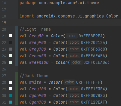
일단 Color.kt에 색상 자체를 추가하자
그리고 Theme.kt에서 색 조합(=팔레트)을 설정한다
private val LightColorPalette = lightColors(
    background = Green100,
    surface = Green50,
    onSurface = Grey900,
    primary = Grey50,
    onPrimary = Grey900,
    secondary = Grey700
)

private val DarkColorPalette = darkColors(
    background = Cyan900,
    surface = Cyan700,
    onSurface = White,
    primary = Grey900,
    onPrimary = White,
    secondary = Grey100
)
그래놓고 이제 원하는 부분에 색상을 설정하는 코드를 넣으면 된다
@Composable
fun WoofApp() {
    LazyColumn(modifier = Modifier.background(MaterialTheme.colors.background)) {
        items(dogs) {
            DogItem(dog = it)
        }
    }
}
@Composable
fun DogItem(dog: Dog, modifier: Modifier = Modifier) {
Row(
modifier = Modifier
.fillMaxWidth()
.padding(8.dp)
.background(MaterialTheme.colors.surface)
) {
DogIcon(dog.imageResourceId)
DogInformation(dog.name, dog.age)
}
}@Composable
fun DogInformation(@StringRes dogName: Int, dogAge: Int, modifier: Modifier = Modifier) {
Column {
Text(
text = stringResource(dogName),
color = MaterialTheme.colors.onSurface,
modifier = modifier.padding(top = 8.dp)
)
Text(
text = stringResource(R.string.years_old, dogAge),
color = MaterialTheme.colors.onSurface
)
}
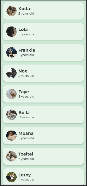
}요렇게 MaterialTheme.colors.어쩌구를 붙여주자
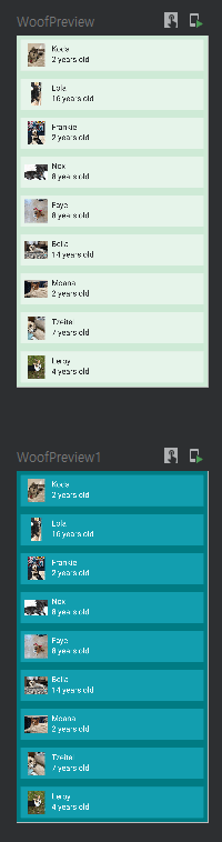
그러면 이제 dark모드일땐 우리가 dark모드로 설정한 색상들이 나오고
light 모드일 땐 우리가 light 모드로 설정한 색상들이 나온다
preview 함수를 하나 더 만들어서 확인해보자
결과화면
shape 설정
shape은 말 그대로 모양이다
여기서는 Image와 Card composable의 모양을 변경해본다
Shape.kt
val Shapes = Shapes(
    small = RoundedCornerShape(4.dp),
    medium = RoundedCornerShape(4.dp),
    large = RoundedCornerShape(0.dp)
)
여기서 small, medium, large는 composable를 크기별로 구분한 것이다
우리가 바꿀 Card는 medium에 해당한다
RoundedCornerShape이라는 친구는 직사각형의 꼭짓점을 둥그렇게 만들어주는 객체이다
Dog Icon의 Image를 원형으로 만들어보자
clip이라는 친구를 사용하면 원하는 모양으로 자를 수 있다
그리고 ContentScale을 crop으로 설정해주면 이미지를 도형에 맞추기 때문에
모든 이미지를 같은 크기로 만들 수 있다
@Composable
fun DogIcon(@DrawableRes dogIcon: Int, modifier: Modifier = Modifier) {
Image(
modifier = modifier
.size(64.dp)
.padding(8.dp)
.clip(RoundedCornerShape(50)),
contentScale = ContentScale.Crop,
painter = painterResource(dogIcon),
/*
* Content Description is not needed here - image is decorative, and setting a null content
* description allows accessibility services to skip this element during navigation.
*/
contentDescription = null
)
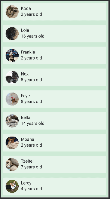
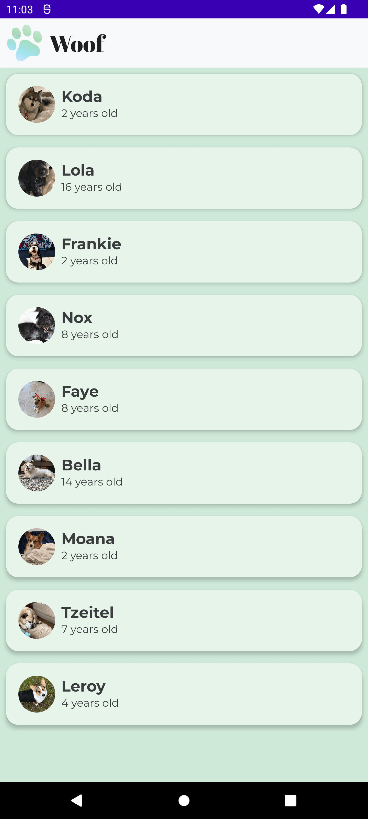
}결과화면
다음은 DogItem에 있는 Row를 둥그렇게 만들어보자
그런데 Row 자체에는 shape을 설정할 수 있는 기능이 없다
그래서 Card로 Row를 둘러싸면 된다
Shape.kt에서 medium에 해당하는 값을 바꿔주고
Card끼리 padding을 주고 elevation도 넣어주면
val Shapes = Shapes(
    small = RoundedCornerShape(4.dp),
    medium = RoundedCornerShape(16.dp),
    large = RoundedCornerShape(0.dp)
)
@Composable
fun DogItem(dog: Dog, modifier: Modifier = Modifier) {
Card(
modifier = Modifier.padding(8.dp),
elevation = 4.dp
) {
Row(
modifier = Modifier
.fillMaxWidth()
.padding(8.dp)
) {
DogIcon(dog.imageResourceId)
DogInformation(dog.name, dog.age)
}
}
}결과화면

Card는 색상의 관점에서 Surface에 해당한다
그런데 우리는 Surface와 OnSurface 색상을 설정해놓았기 때문에
이제 Card에 있는 Row의 background 설정과
Card에 있는 DogInformation에 있는 Text의 color 속성을 없애줘도 된다
font 설정
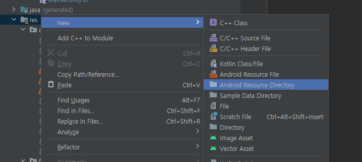
다운로드 받은 글꼴을 쓰고 싶다면 디렉토리를 추가해야 한다
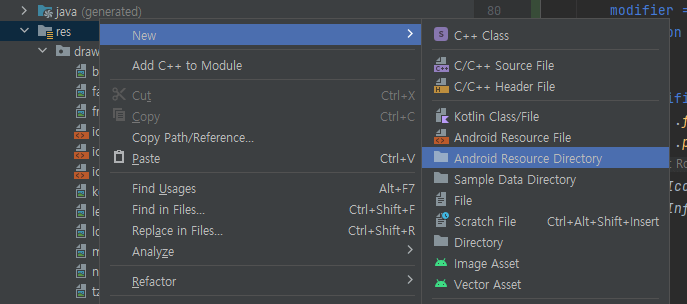
res 폴더에 마우스 우클릭 -> new -> Android Resource Directory를 선택한다
directory name와 resource type을 font로 설정해주고 ok를 누른다
https://fonts.google.com/?hl=ko
Google Fonts
Making the web more beautiful, fast, and open through great typography
fonts.google.com
이곳으로 이동해서
Montserrat
과 Abril Fatface 글꼴을 다운받는다우측 위에 download family를 누르면 됨
AbrilFatface-Regular.ttf와 Montserrat-Regular.ttf, Montserrat-Bold.ttf를 만들어 놓은 font 폴더로 옮긴다
그리고 abrilfatface_regular.ttf와 montserrat.ttf, montserrat_bold.ttf로 이름을 바꿔준다
그리고 다음을 참조해서
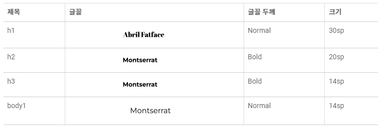
type.kt 파일을 다음과 같이 작성해주자
val Abrilfatface = FontFamily(
    Font(R.font.abrilfatface_regular)
)

val Montserrat = FontFamily(
    Font(R.font.montserrat),
    Font(R.font.montserrat_bold, FontWeight.Bold)
)

// Set of Material typography styles to start with
val Typography = Typography(
    h1 = TextStyle(
        fontFamily = Abrilfatface,
        fontWeight = FontWeight.Normal,
        fontSize = 30.sp
    ),
    h2 = TextStyle(
        fontFamily = Montserrat,
        fontWeight = FontWeight.Bold,
        fontSize = 20.sp
    ),
    h3 = TextStyle(
        fontFamily = Montserrat,
        fontWeight = FontWeight.Bold,
        fontSize = 14.sp
    ),
    body1 = TextStyle(
        fontFamily = Montserrat,
        fontWeight = FontWeight.Normal,
        fontSize = 14.sp
    )
)
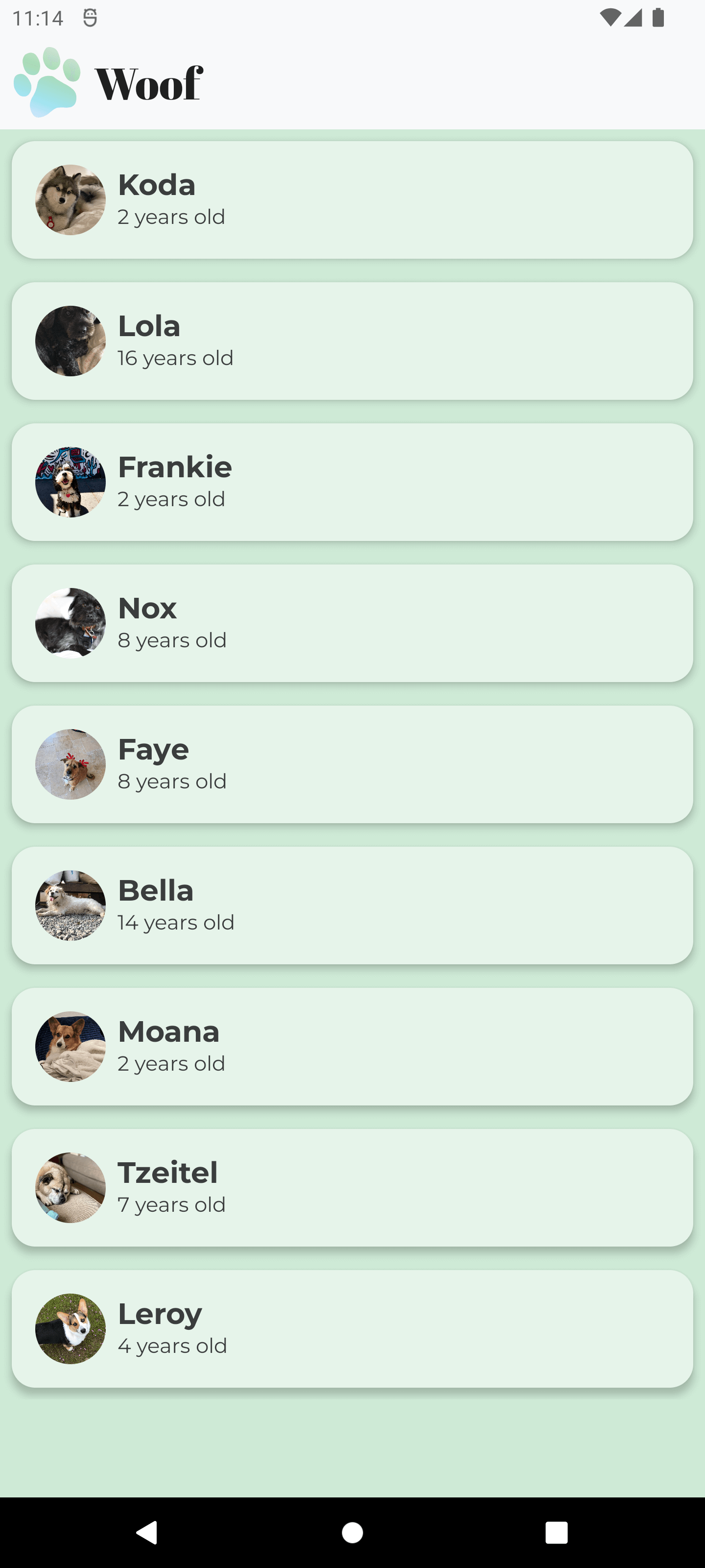
이제 글꼴이 준비되었으니
적용을 시켜줄 차례이다
@Composable
fun DogInformation(@StringRes dogName: Int, dogAge: Int, modifier: Modifier = Modifier) {
    Column {
        Text(
            text = stringResource(dogName),
            style = MaterialTheme.typography.h2,
            modifier = modifier.padding(top = 8.dp)
        )
        Text(
            text = stringResource(R.string.years_old, dogAge),
            style = MaterialTheme.typography.body1
        )
    }
}
결과화면
상단바 추가
Scaffold라는 친구가 있다
이 친구는 top bar, bottom bar, float action button을 쉽게 만들 수 있게 해준다
WoofTopAppBar라는 composable을 만들고 scaffold를 이용해 top bar로 만들어보자
@Composable
fun WoofTopAppBar(modifier : Modifier = Modifier){
    Row(
        modifier = modifier
            .background(MaterialTheme.colors.primary)
            .fillMaxWidth(),
        verticalAlignment = Alignment.CenterVertically
    ){
        Image(
            modifier = Modifier
                .size(64.dp)
                .padding(8.dp),
            painter = painterResource(R.drawable.ic_woof_logo),
            contentDescription = null
        )
        Text(
            text = stringResource(R.string.app_name),
            style = MaterialTheme.typography.h1
        )
    }
}
@Composable
fun WoofApp() {
Scaffold(
topBar = {WoofTopAppBar()}
){
LazyColumn(modifier = Modifier.background(MaterialTheme.colors.background)) {
items(dogs) {
DogItem(dog = it)
}
}
}
}결과화면
상태표지줄 변경
위의 top app bar 완성 이미지를 보면 위의 포라색 상태표시줄이 정말 거슬린다
얘를 바꿔보자
app -> res -> values -> colors.xml로 이동해서
다음과 같이 바꿔주자
<resources>
   <color name="grey_50">#FFF8F9FA</color>
   <color name="grey_900">#FF202124</color>
</resources>
app -> res -> values -> themes.xml로 이동해서
다음과 같이 statusBarColor(상태표시줄 색상)을 grey_50으로 바꿔주자
<resources>
   <style name="Theme.Woof" parent="android:Theme.Material.Light.NoActionBar">
       <item name="android:statusBarColor">@color/grey_50</item>
   </style>
</resources>
이 상태로 실행하면 작업표시줄이 희여멀건해진다
그리고 아무런 아이콘도 보이지 않는다
아이콘도 하얗기 때문인데
다음과 같은 친구를 입력해주면 아이콘, 텍스트를 보이게 만들 수 있다
<resources>
<style name="Theme.Woof" parent="android:Theme.Material.Light.NoActionBar">
<item name="android:statusBarColor">@color/grey_50</item>
<item name="android:windowLightStatusBar">true</item>
</style>
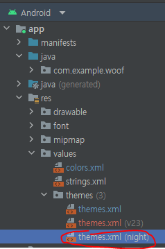
</resources>참고로 오류가 뜨니 alt+enter를 눌러 Override Resources in values-v23을 선택해주자

그러면 themes 디렉토리에 themes.xml (v23)이라고 되어있는 친구가 하나 생긴다
파일 내용은 다 똑같은데 v23이라고 되어있다
아마 API레벨을 말하는듯 앱 아이콘 설정할 때 봤던 v26처럼
아무튼 이렇게까지 하면 이쁜 상태표시줄을 볼 수가 있다
dark theme에서 상태표시줄이 grey_900이 되게 해주려면
res 디렉토리에 values-night라는 android resource directory를 만들어줘야 한다

만들어놓고서는 프로젝트 뷰를 바꿔줘야 찾을 수 있다
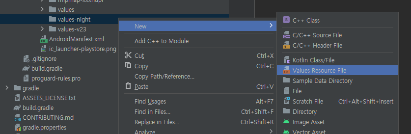
이제 values-night 디렉토리에 themes.xml이라는 values resource file을 추가하자
그리고 다음과 같이 작성해주자
<?xml version="1.0" encoding="utf-8"?>

<resources>
    <style name="Theme.Woof" parent="android:Theme.Material.NoActionBar">
        <item name="android:statusBarColor">@color/grey_900</item>
    </style>
</resources>
아이콘을 검정색으로 바꿀 필요가 없으므로
android:windowsStatusLightBar 구문은 필요가 없다
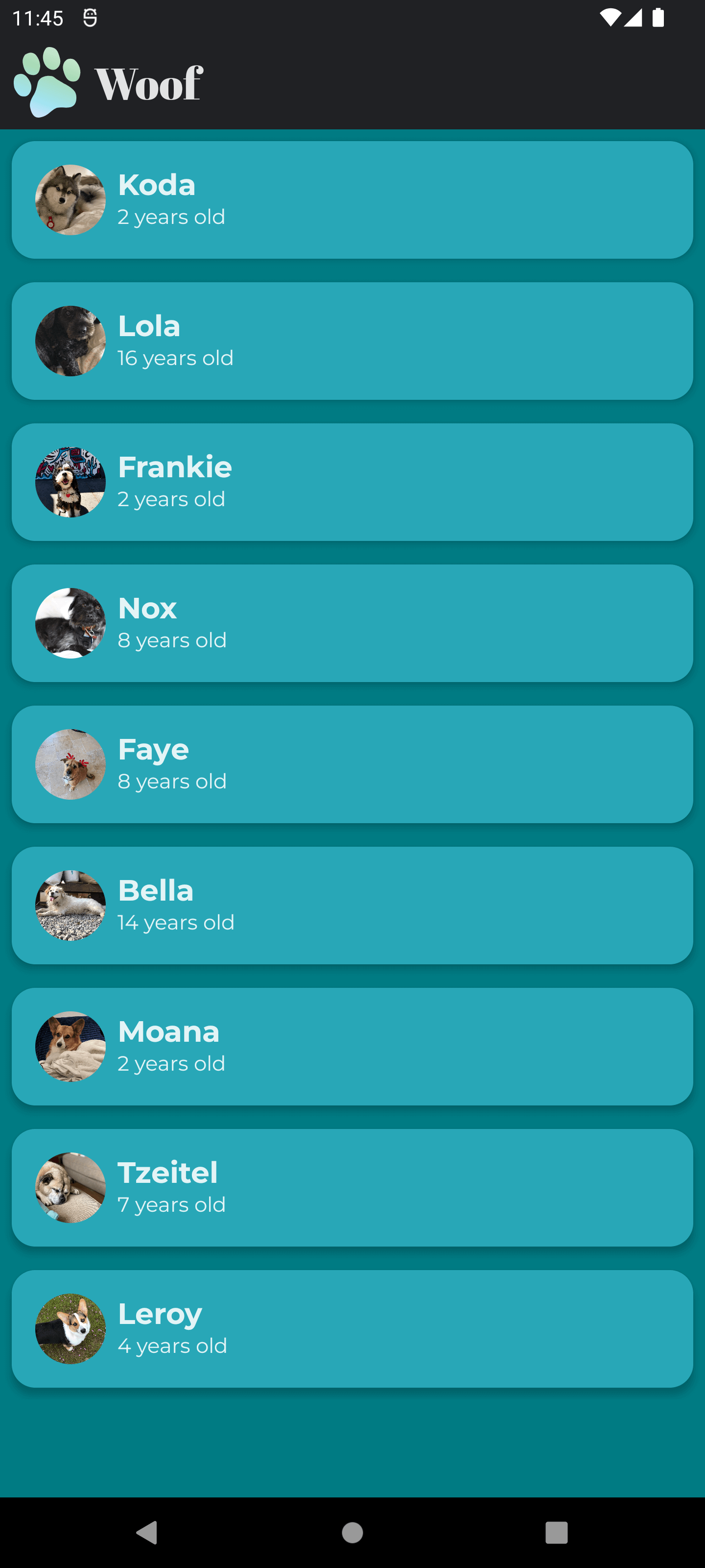
결과 화면은 다음과 같다
참고로 작업표시줄이 검정색으로 잘 바뀌는 지 확인할 때에는
에뮬레이터에서 직접 다크모드를 켜줘야 한다
preview에 있는 건 그냥 다크모드인지 확인을 하는 구문일 뿐이고
진짜 다크모드가 되는 건 아님
참고 하나 더
values-night/themes.xml을 추가했다면
이제 프로젝트 뷰를 원래대로 되돌려도 잘 보인다
'기타 > 안드로이드' 카테고리의 다른 글
| 29. 앱의 접근성 개선 (0) | 2022.11.06 |
|---|---|
| 28. Woof App : 애니메이션, icon 추가 (2) | 2022.10.29 |
| 26. Course App : Grid 구성 (0) | 2022.10.21 |
| Android Studio에서 emulator 녹화하는 방법 (2) | 2022.10.15 |
| 25. 앱 아이콘 바꾸기 (0) | 2022.10.14 |


