
SuperHero App 만들기 : Material Design, App Icon, Lazy Column 복습
연습: Superheroes 앱 빌드하기 | Android Developers
Material Design의 개념을 바탕으로, 목록과 간단한 애니메이션을 사용하여 슈퍼히어로 목록을 빌드합니다.
developer.android.com
위의 페이지를 참고하여 Woof App과 흡사한 SuperHero App을 만들어보자
준비하기
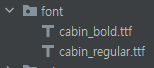
폰트 다운로드
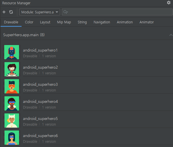
drawables 추가
string.xml
<resources>
<string name="app_name">Superheroes</string>
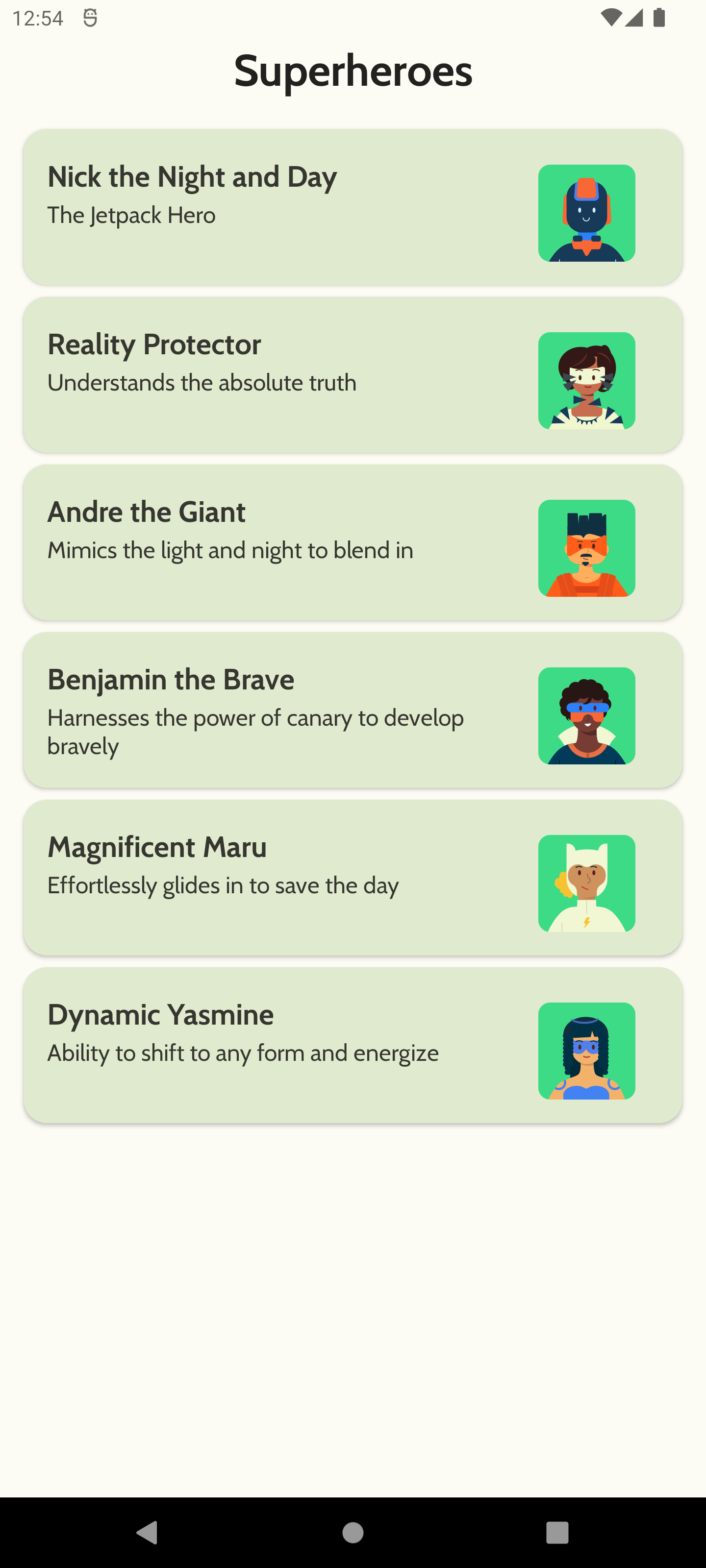
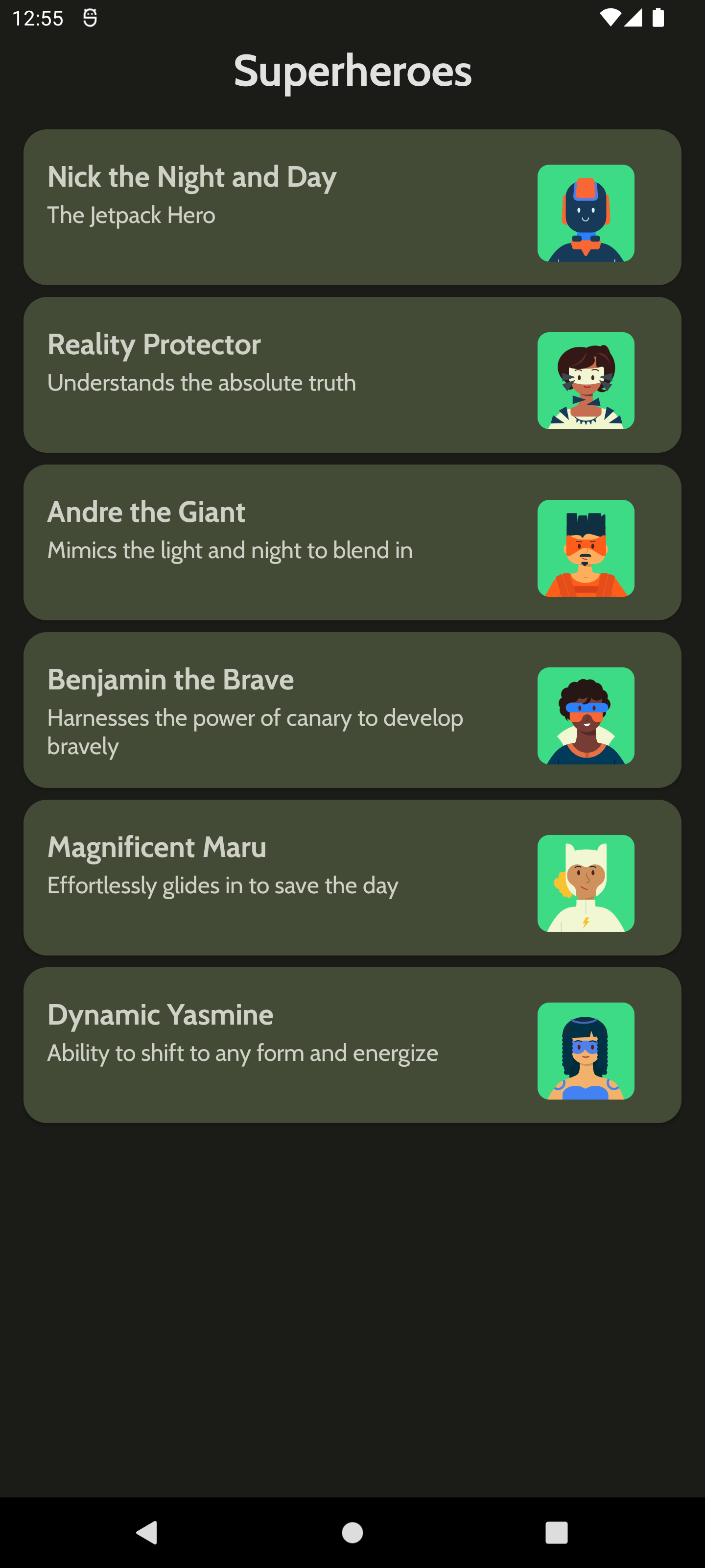
<string name="hero1">Nick the Night and Day</string>
<string name="description1">The Jetpack Hero</string>
<string name="hero2">Reality Protector</string>
<string name="description2">Understands the absolute truth</string>
<string name="hero3">Andre the Giant</string>
<string name="description3">Mimics the light and night to blend in</string>
<string name="hero4">Benjamin the Brave</string>
<string name="description4">Harnesses the power of canary to develop bravely</string>
<string name="hero5">Magnificent Maru</string>
<string name="description5">Effortlessly glides in to save the day</string>
<string name="hero6">Dynamic Yasmine</string>
<string name="description6">Ability to shift to any form and energize</string>
</resources>
Hero.kt
package com.example.superhero.data

import androidx.annotation.DrawableRes
import androidx.annotation.StringRes

data class Hero(@StringRes val nameRes: Int, @StringRes val descriptionRes: Int, @DrawableRes val imageRes: Int)
HeroesRepository.kt
package com.example.superhero.data

import com.example.superhero.R
import com.example.superhero.data.Hero

object HeroesRepository {
    val heroes = listOf(
        Hero(
            nameRes = R.string.hero1,
            descriptionRes = R.string.description1,
            imageRes = R.drawable.android_superhero1
        ),
        Hero(
            nameRes = R.string.hero2,
            descriptionRes = R.string.description2,
            imageRes = R.drawable.android_superhero2
        ),
        Hero(
            nameRes = R.string.hero3,
            descriptionRes = R.string.description3,
            imageRes = R.drawable.android_superhero3
        ),
        Hero(
            nameRes = R.string.hero4,
            descriptionRes = R.string.description4,
            imageRes = R.drawable.android_superhero4
        ),
        Hero(
            nameRes = R.string.hero5,
            descriptionRes = R.string.description5,
            imageRes = R.drawable.android_superhero5
        ),
        Hero(
            nameRes = R.string.hero6,
            descriptionRes = R.string.description6,
            imageRes = R.drawable.android_superhero6
        )
    )
}
테마 설정하기
Color.kt
package com.example.superhero.ui.theme

import androidx.compose.ui.graphics.Color

//Light Theme
val md_theme_light_background = Color(0xFFFDFCF4)
val md_theme_light_surface = Color(0xFFE0EACE)
val md_theme_light_secondary = Color(0xFF596148)
val md_theme_light_onSurface = Color(0xFF1B1C18)
val md_theme_light_primary = Color(0xFF466800)
val md_theme_light_onPrimary = Color(0xFF223600)

// Dark Theme
val md_theme_dark_background = Color(0xFF1B1C18)
val md_theme_dark_surface = Color(0xFF373F29)
val md_theme_dark_secondary = Color(0xFFDDE6C6)
val md_theme_dark_onSurface = Color(0xFFE4E3DB)
val md_theme_dark_primary = Color(0xFFC1CAAB)
val md_theme_dark_onPrimary = Color(0xFFDDE6C6)
Shape.kt
package com.example.superhero.ui.theme

import androidx.compose.foundation.shape.RoundedCornerShape
import androidx.compose.material.Shapes
import androidx.compose.ui.unit.dp

val Shapes = Shapes(
    small = RoundedCornerShape(8.dp),
    medium = RoundedCornerShape(16.dp),
    large = RoundedCornerShape(16.dp)
)
Type.kt
package com.example.superhero.ui.theme

import androidx.compose.material.Typography
import androidx.compose.ui.text.TextStyle
import androidx.compose.ui.text.font.Font
import androidx.compose.ui.text.font.FontFamily
import androidx.compose.ui.text.font.FontWeight
import androidx.compose.ui.unit.sp
import com.example.superhero.R

val Cabin = FontFamily(
    Font(R.font.cabin_regular, FontWeight.Normal),
    Font(R.font.cabin_bold, FontWeight.Bold)
)

// Set of Material typography styles to start with
val Typography = Typography(
    defaultFontFamily = Cabin,
    h1 = TextStyle(
        fontWeight = FontWeight.Bold,
        fontSize = 30.sp
    ),
    h2 = TextStyle(
        fontWeight = FontWeight.Bold,
        fontSize = 20.sp
    ),
    h3 = TextStyle(
        fontWeight = FontWeight.Bold,
        fontSize = 20.sp
    ),

    body1 = TextStyle(
        fontWeight = FontWeight.Normal,
        fontSize = 16.sp
    )
)
Theme.kt
package com.example.superhero.ui.theme

import androidx.compose.foundation.isSystemInDarkTheme
import androidx.compose.material.MaterialTheme
import androidx.compose.material.darkColors
import androidx.compose.material.lightColors
import androidx.compose.runtime.Composable

private val DarkColorPalette = darkColors(
    background = md_theme_dark_background,
    surface = md_theme_dark_surface,
    onSurface = md_theme_dark_onSurface,
    primary = md_theme_dark_primary,
    onPrimary = md_theme_dark_onPrimary,
    secondary = md_theme_dark_secondary
)

private val LightColorPalette = lightColors(
    background = md_theme_light_background,
    surface = md_theme_light_surface,
    onSurface = md_theme_light_onSurface,
    primary = md_theme_light_primary,
    onPrimary = md_theme_light_onPrimary,
    secondary = md_theme_light_secondary
)


@Composable
fun SuperHeroTheme(darkTheme: Boolean = isSystemInDarkTheme(), content: @Composable () -> Unit) {
    val colors = if (darkTheme) {
        DarkColorPalette
    } else {
        LightColorPalette
    }

    MaterialTheme(
        colors = colors,
        typography = Typography,
        shapes = Shapes,
        content = content
    )
}
Card와 Column 만들기
card
상세사항
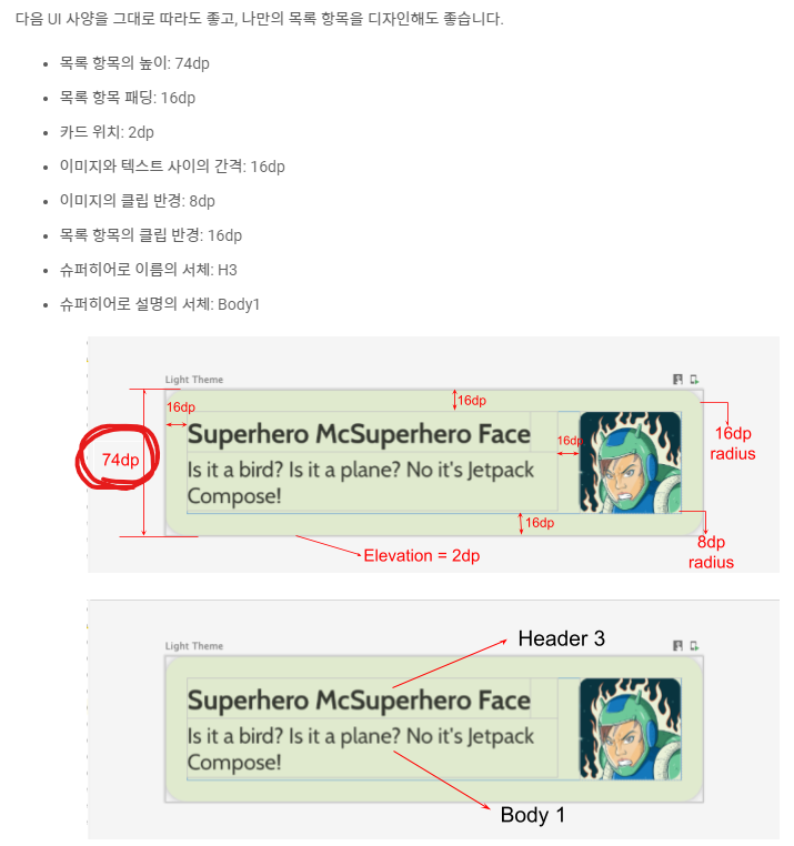
코드
@Composable
fun HeroCard(hero: Hero, modifier: Modifier = Modifier) {
    Card(
        elevation = 2.dp,
        modifier = modifier
    ){
        Row(
            modifier = Modifier
                .height(106.dp)
                .padding(16.dp)
        ){
            Column(
                modifier = Modifier.weight(1f)
            ){
                Text(
                    text = stringResource(hero.nameRes),
                    style = MaterialTheme.typography.h3
                )
                Text(
                    text = stringResource(hero.descriptionRes),
                    style = MaterialTheme.typography.body1
                )
            }
            Spacer(modifier = Modifier.width(16.dp))
            Image(
                painter = painterResource(hero.imageRes),
                contentDescription = null,
                modifier = modifier.clip(RoundedCornerShape(8.dp))
            )
        }
    }
}
74dp가 padding 제외 값이다..
Column
상세사항
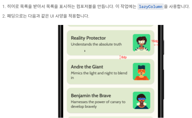
코드
@Composable
fun HeroColumn(heroList: List<Hero>, modifier: Modifier = Modifier){
    LazyColumn(
        modifier = modifier
    ){
        items(heroList){ hero ->
            HeroCard(
                hero,
                Modifier.padding(
                    start = 16.dp,
                    top = 8.dp,
                    end = 16.dp,
                )
            )
        }
    }
}
TopAppBar 추가 및 작업표시줄 색 변경
TopAppBar와 Scaffold 코드
@Composable
fun HeroTopAppBar(modifier: Modifier = Modifier){
    Row(
        modifier = modifier
            .height(56.dp)
            .fillMaxWidth(),
        horizontalArrangement = Arrangement.Center
    ){
        Text(
            text = "Superheroes",
            style = MaterialTheme.typography.h1
        )
    }
}
@Composable
fun HeroApp(){
Scaffold(
topBar = { HeroTopAppBar() }
){
HeroColumn(HeroesRepository.heroes)
}
}
res/values/themes 경로의
themes.xml, themes.xml(v23)
<?xml version="1.0" encoding="utf-8"?>
<resources>
    <style name="Theme.SuperHero" parent="android:Theme.Material.Light.NoActionBar">
        <item name="android:statusBarColor">@color/md_theme_light_background</item>
        <item name="android:windowLightStatusBar">true</item>
    </style>
</resources>
themes.xml(night)
<?xml version="1.0" encoding="utf-8"?>
<resources>
    <style name="Theme.SuperHero" parent="android:Theme.Material.NoActionBar">
        <item name="android:statusBarColor">@color/md_theme_dark_background</item>
    </style>
</resources>
결과화면
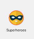
앱 아이콘 추가
리소스 매니져에서 image asset 추가 및 resizing
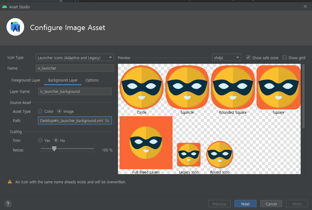
결과화면
'기타 > 안드로이드' 카테고리의 다른 글
| 32. Dessert Clicker App : Activity Life Cycle (2) | 2022.11.15 |
|---|---|
| 31. 30 Days Of Habit App (0) | 2022.11.10 |
| 29. 앱의 접근성 개선 (0) | 2022.11.06 |
| 28. Woof App : 애니메이션, icon 추가 (2) | 2022.10.29 |
| 27. Woof App : Material Design (0) | 2022.10.29 |


